
dsh-web
zhu1090093659/dsh-webDeepSeek Harness(DSH)Web 插件聚合生态包 · 一切皆插件,创意工坊分发(dsh-market.com)

dsh-any-background 的增强分支。v0.4.0 起的改动为本 fork 自作,新增左右双图轮播:同一轮播在窗口两侧各推进一步,以绝对中心为分界,壁纸不再被会话区完全挡住。两条车道还可各读一个文件夹(左右各一),共用同一轮播频率与模式,左右边缘淡化效果完全一致。
English | 中文
This is a fork, and this half of it is mine. Modified from Tkingxiao/dsh-any-background (MIT), which built the colour wheel, the per-surface opacity/blur system, the generated backgrounds and the rotation engine. Everything from v0.4.0 onward is this fork's own work — see What this fork adds below. Upstream: github.com/Tkingxiao/dsh-any-background.
A DeepSeek Harness appearance plugin: custom theme colour, background wallpaper (image / algorithmically generated), and fine-grained per-surface opacity & blur controls — plus this fork's dual-lane wallpaper, two-folder rotation and a floating rotate-now orb with a live countdown ring. Compatible with DSH 0.1.5-rc.2 ~ 0.2.1-alpha.2.
These are the features I built on top of upstream. They are the reason this fork exists.
dual toggle paints two different pictures of the same rotation at once, one down each side of the viewport, clear of the centre column. The motivation is geometric rather than decorative: the wallpaper is painted behind the whole app while the host's conversation column sits on top of the middle, so a picture whose subject is dead centre has that subject exactly where it cannot be seen. Two lanes hug the edges instead, and the picture that used to be half-hidden becomes the one you actually look at. Off by default.pickRotationIndex() (same shuffle/order semantics, same "never repeat the current picture"), and the right index is taken from nextLaneIndex(), which steps forward from the left one. Stepping rather than drawing again is deliberate — the shuffle RNG is unseeded, so two independent draws would occasionally collide and paint the same picture twice, which is precisely what dual mode exists to avoid. In order mode the pair is simply adjacent pictures. The pair is persisted as laneItems, so it survives a reload and cannot drift apart.current, the right one is recovered by looking up the name the right lane is already showing in its own listing. That matters as soon as the two directories differ in length, because a single shared index would walk the shorter listing off its end. Only once both directories exist does the wall change; picking just one stores it without previewing, so the wall is never left half split with a stale lane on the other side. The single-folder mode is still there — the pair is a third source, not a replacement.wpLeftEl and wpRightEl are peer position:fixed; width:50%; z-index:-1 elements, one pinned to each edge, and both are given the same pixel width — Math.floor(innerWidth * 0.5) — so an odd viewport width cannot leave one lane a pixel wider than the other. The overhang that lets a picture reach the seam is applied only in center mode: in fit the picture is contained inside its lane by construction, so an overhang there would make the two lanes overlap at the seam and whichever painted second would win the strip — one picture visibly encroaching on the other, which is the asymmetry this mode exists to prevent.minutes cadence — that is the only interval whose remaining time is knowable in the browser (reload is due on every read, daily/weekly are settled by the node half as the page loads, and a disabled rotation never falls due at all), so for those the button is drawn alone rather than showing a ring that would always read "full" and be a lie. Clicking advances the rotation, and because the advance stamps lastRotate the ring refills by itself. It is mounted as its own React root that portals to <body>, so neither the settings dialog's scroll column nor a host transform can clip it. Drag it and it stays where you put it (the position is remembered per window, re-clamped into the viewport on every resize); right-click it to send it back to the corner. It is drawn with the host's own floating-button recipe rather than a lookalike — --dsw-alias-button-floating-fill / -hover, --dsw-elevation-panel, --dsw-elevation-stroke-color: var(--dsw-alias-border-l3) and --dsw-alias-label-primary, the same tokens the host's scroll-to-bottom control resolves against, so it follows the theme colour and the light/dark switch by construction. Dropping it onto <html> instead — a sibling of <body>, so on the far side of every design token — would have left it a transparent outline, which is measured, not assumed.BackgroundType no longer carries 'video', the rotation no longer carries media / videoFolder / videoName / videoVolume / videoAlign / ended, and the whole src/client/utils/video.ts module is removed. A stored config that still names a video rotation falls back to images on normalize.peerDependencies before importing a single module, so an enumeration of release strings is a hard expiry date: publish a host release it does not name and the plugin is refused at load, then dropped from dsh.profile.bundles by the next plugin-manager write. The gate is a semver range now (>=0.1.5-rc.2 <0.3.0-0), and dsh.compatibility.dshReleases keeps the explicit record of the ten releases that were actually checked, through 0.2.1-alpha.2. Diffing the 0.2.0-rc.1 and 0.2.1-alpha.2 packages showed ThemeRuntime and SidebarRightTabRegistry unchanged, so this build needs no new adapter folder — it joins the folder whose facts held.
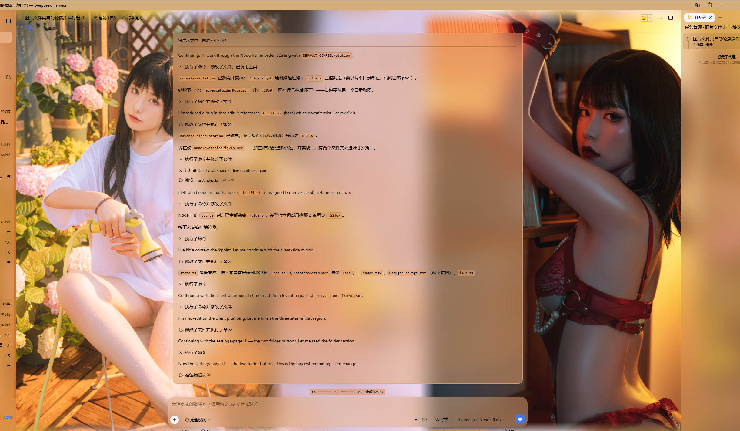
Dual-lane wallpaper · two different pictures of one rotation, split at the window's absolute centre, clear of the conversation column
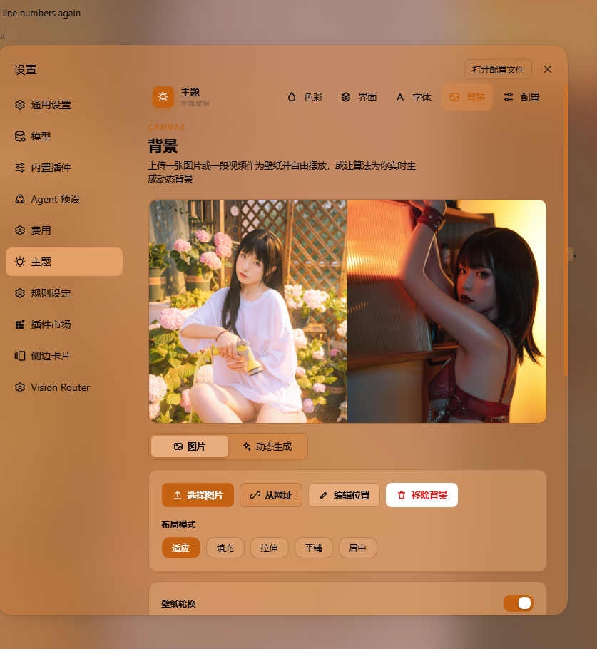
The background page of the theme settings · source, folder picker, layout mode and wallpaper rotation
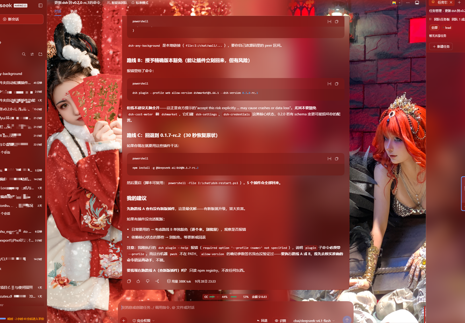
Theme colour and per-surface opacity · PS-style wheel, smart extraction, per-surface sliders
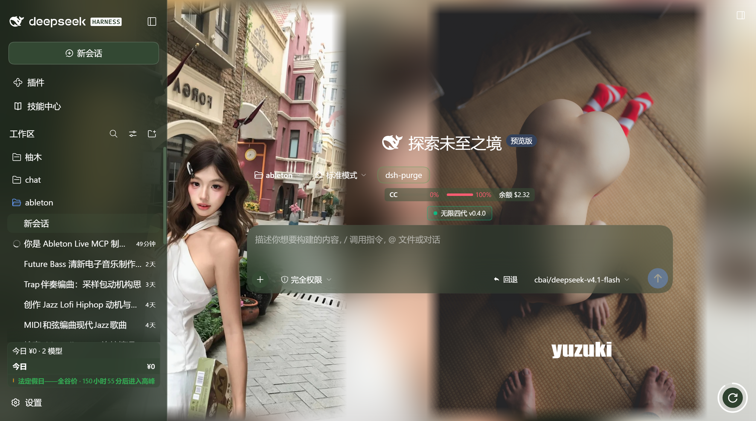
Rotate-now orb · the host's own floating-button styling, draggable (right-click to reset), with a countdown ring on the minutes cadence
backdrop-filter blur (0–60 px) per surface, including a real backdrop on the composer, the Cordis panel and popover surfaces via stable host selectors.code highlight chips and produced chips share one opacity + blur slider. The opacity is the alpha of each surface's own background color (no second color stacked on top of the original), and the blur frosts that same layer so the wallpaper shows through the content.panelOpacity / blurs.panel), two identities: without dsh-better-sidebar it reads "右方侧边栏" (Right sidebar) and drives the official right Sidebar's surface tokens and frosted blur (works on 0.1.5-rc.2 through 0.1.7); with dsh-better-sidebar installed it reads "bettersidebar" and takes over that plugin's bottom workbench panel (the official sidebar keeps responding too). The row is always visible.conversation.session.header* slot anchors and tags the open popover at runtime instead of relying on class shapes.sidebarRightTabs + the sidebar.right.pane.tab keyed seat); with dsh-better-sidebar installed, the page registers in that plugin's sidebar instead and the official guide card withdraws itself, so the two never duplicate. Settings panel, official sidebar and better-sidebar all share one page implementation and one state store — a change in any of them shows up everywhere. The shell adapts to the panel width, and a narrow panel tightens padding and falls back to a single column. On a host without the right Sidebar the registration silently never happens.dsh-any-theme.json (config + wallpaper, embedded as data URLs) and import to restore it anywhere.@font-face; toggle it off or remove it at any time. Fonts stream as raw bytes and persist in the plugin data dir; code blocks keep their monospace stack.-webkit-text-stroke: width 0–4 px (0 = off) and a color of auto-contrast / gray / black / white / accent / custom. Code blocks, inline code, icons and the host's background-clip: text shimmer chrome (the "深度求索中" turn-status line and the turn-process rows) are exempted automatically, so multi-color syntax never smears and gradient text is never flattened into a stroke-coloured blob.Auto both the surface and font directions follow the accent's lightness (dark pick → light fonts, light pick → dark fonts), falling back to the wallpaper's perceived brightness when no color is picked.~/.dsh/.dsh-any-background-data/, not localStorage.engines.dsh, all seven gated @deepseek-ai/dsh-* peerDependencies and dsh.compatibility.dsh were 0.1.5-rc.2 || 0.1.5-rc.3 || … || 0.2.0-rc.1 — an enumeration that had to be edited, rebuilt and re-released before the plugin could run on any host release that came after the last entry. They are >=0.1.5-rc.2 <0.3.0-0 now. The upper bound is deliberate: <0.3.0-0 admits every 0.2.x prerelease — the -0 suffix is what makes a prerelease boundary inclusive, so 0.3.0-alpha.1 is excluded while 0.2.1-alpha.9 is not — and it still stops before 0.3.0, where the host is expected to change shape again.0.2.1-alpha.2 the enumeration did not cover the running release, so evaluatePluginCompatibility returned an issue and loadProfileDirectory threw it into skippedBundles — silently, without printing and without touching the manifest. A later plugin-manager write ran reconcileProfilePlugins, whose retention rule keeps a dependency only when it is still classified as a bundle, and dsh-any-background was dropped from dsh.profile.bundles entirely. The symptom the user saw was the plugin simply not being there. Widening the range is what stops the first half from happening again; the second half is a host-side behaviour this plugin cannot influence, so the entry had to be restored in the profile manifest as well.dsh.compatibility.dshReleases keeps its explicit list, and gained 0.2.1-alpha.2. That map is the human-readable record of which releases were actually checked, so it stays an enumeration — a range there would assert coverage nobody verified. The semver range is the machine gate; this map is the claim about what has been looked at.semver.satisfies from the host's bundled semver@7.8.5 was run with {includePrerelease: true} over the range — 0.1.5-rc.2 through 0.2.1-alpha.2 all satisfy it, 0.3.0-alpha.1 and 1.0.0 do not.SUPPORTED_RELEASES gained a 0.2.1-alpha.2 row, so the adapter registry now reports exact for the host that is actually running instead of clamping to nearest and logging a clamp warning on every start. The row joins the 0.1.7-alpha folder because the 0.2.1-alpha.2 packages still ship ThemeRuntime and SidebarRightTabRegistry in the shape that folder records — a new row, not a new adapter folder. This is the adapter table, not the load gate: classifyRelease returns match: 'nearest' for anything it does not know, which is a log line, never a refusal.{x, y} to localStorage under dab-orb-pos — not to the plugin config. That split is deliberate: the position belongs to this window on this screen, not to the theme, and putting it in the config would drag the Node half into a purely presentational concern and make every drag need a host restart to take effect. The corner is the default, and it stays the default in the CSS — the stored position is only consulted when one exists, and right-clicking the orb deletes it and drops the button back to the corner rather than to a pinned approximation of it. A stored position is re-clamped after every resize (the button keeps its last known size in a ref, so the clamp has something to measure even on the first frame), which is what stops a position saved on a wide monitor from parking the orb off-screen on a narrow one.ChatView.module.css's own EvIC1a_toBottom scroll-to-bottom control — --dsw-alias-button-floating-fill with -hover behind it, --dsw-elevation-panel as the shadow with --dsw-elevation-stroke-color: var(--dsw-alias-border-l3) supplying its hairline, --dsw-alias-label-primary for the glyph, border-radius: 100px with corner-shape: round, 34px square. The old orb was a hand-picked dark rounded square; the new one is drawn from the same tokens the host's own floating controls resolve against, so it follows the theme colour, the light/dark switch and the elevation recipe without any of them being restated. Measured on the live page rather than assumed: computed border-radius: 100px, corner-shape: superellipse(1), cursor: grab, and a glyph colour that matches --dsw-alias-label-primary exactly.@keyframes dab-orb-in was applied with animation-fill-mode: both, which keeps the last keyframe applied after the animation ends — so the final transform: none went on pinning the button's transform forever and neither :hover nor :active could scale it. The fill mode is backwards now, which is what you want from an entrance animation: it holds the starting frame before the animation begins and then releases the property completely..dab-root, and the orb is portalled out of that subtree onto <body>, so the one element that animates on every rotation and repaints once a second was exempt from the preference. Its own selector is spelled out in that media block now.Portal mounts to <body>, and this was a real bug rather than a hygiene fix: every --dsw-alias-* token is declared only on body / body[data-ds-dark-theme] (209 declaration sites, no :root, no html), so a portal host appended to document.documentElement — <body>'s sibling, not its ancestor — inherited none of them and fell back to nothing: the toast's background: var(--dsw-alias-bg-layer-3, var(--dsw-alias-bg-layer-2)) resolved to no value at all and the toast rendered fully transparent, its border black, its z-index: 10001 intact. Measured by putting the real .dab-toast class in a replica portal host under each parent: under <body> the same class computes background: rgba(92, 95, 69, 0.5) and border: 1px solid rgba(117, 119, 95, 0.22); under <html> it computes background: rgba(0, 0, 0, 0) with both token lookups empty. The orb was portalled the same way and was equally token-blind — the only reason it looked styled is that the default styling was rebuilt with hard-coded values in v0.4.3.DeepSeek Harness(DSH)Web 插件聚合生态包 · 一切皆插件,创意工坊分发(dsh-market.com)
把回答做成一页可视化 HTML:模型只写简短的 Markdown 草稿,随包附带的 `am` 命令行生成页面,支持流程图、时序图、树、时间线、ER 图、表格和提示框。
在 dsh 里装上这个插件即可,无需登录、注册或填 API Key,就能使用包括 Muse Spark 1.3、MiMo V2.6 在内的前沿模型——完全免费,不限量。 All you do is install this plugin in dsh: no login, no sign-up, no API key — the frontier models are just there, Muse Spark 1.3 and MiMo V2.6 among them. Completely free, with no usage cap.

